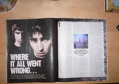
*The image is in black and white, and the artists seem to be wearing black clothing so all you can see is their heads a close up shot has been used which bring the characters eye level to the readers eye level, this is a suitable shot to use, as it portrays the emotions of the person as well as showing the detail of their face.
*'WHERE IT ALL WENT WRONG...' makes readers want to know the inside gossip. This seems to be the main piece of text of the page as it has been bolded, and increased in size. Situated below is a brief summary to the introduction and familiarising the readers with the context.
*The article itself starts with a drop cap, this has been used in all the articles that feature within this issue, another common code/convention that is regularly used.
*The main textual piece is presented into 3 columns with regularly spaced paragraphs in order to make it more clear and comprehendible. To space things out a picture of their album cover has been positioned in the middle along with a quote which seems to be in large font. This gives readers a glimpse of what the article is about and contains.
* A rip page effect has been used, so it looks like it has been 'teared' out, this is another predictable convention that is becoming more used within music magazines and example is posted below.

Although this particular one has used film sets etc to portray the concept of a music film etc.
* In the corners a NME small logo is placed along with the page number and issue date.
* The colour scheme appears to be black and white, which make things more prominent and bolder.
* Interestingly unlike other magazines this does not hold the interview format, and is just a story told by the artists which is most unusual.
No comments:
Post a Comment