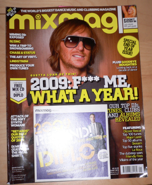

* With every issue MixMag free mix CD which lists 15 free songs. They are free (what otherwise would have been) commodities. The songs that are listed are all house and dance songs, in which many have been 'remixed'.
* The mast head, positioned at the top of the page, is moulded around the character that is the cover issue, in this case David Guetta a notable DJ. 'MixMag' is in a different font in comparison to others on the page and the 'i' has been edited to look more customed and styled than normal above the magazines 'slogan/selling line' is situated describing it as 'the world's biggest' makes the magazine appear very successful and well known etc.
*The corner of the page a hook has been placed which again tells the viewer that their is a 'free mix CD'. The word 'free' has been highlighted in yellow, as every one likes free give-aways, and the more free items and contents the more likely to buy. As this is a 'coming up to new year issue' the magazine focuses more on how good '09 was and what's its brung and how its going to be remembered. Hence, by having a mix CD containing the 'best of '09' makes people more likely to buy it as it is limited and nearly coming to an end. Plus at this time of year everyone is feeling more sentimental about the year and from purchasing the songs can relive many of the parts from it etc.
*Within the top right hand corner a last minute party guide plus has been placed. This indicates the ideologies that the magazine hold and the target audience that it is appealing to, in this case a more youthful, social and outgoing audience. By using the words "DONT STAY IN" its looks more like a command, like you should go out and enjoy yourself. This has been made clear by the dividers placed around it, the stick man running and the picture of a woman partying. The picture of the woman partying is a close up shot which has been used so the viewers can really look at her face and see how much she is enjoying herself and having a good time.
* "SPECIAL END OF YEAR ISSUE" again makes this issue appear limited and a 'one off' etc making more people want to purchase it.
* The main focus picture of David Guetta, is the centrepiece of the cover, and all the cover issues and other titles have been moulded around this. Guetta is wearing normal clothes nothing extravagant just simply a T-shirt and some accessories, he is wearing sun glasses which hide his eyes. Interestingly eyes are normally a means of communication with the customer on a magazine, by hiding his eyes it makes him look more mysterious. In the sunglasses he is wearing a flash light has been placed in the lends, most likely to be done by some form of photo editing software. He is also ungroomed. All of these aspects contribute to the informal atmosphere that the magazine cover creates the sort of relax, 'let your hair down' mood.
* David Guetta's name has been placed and used as a saying "Guetta load of this" this is a way of relating it back to the artist.
*The main cover line again brings attention to the end of the year "2009: F*** ME WHAT A YEAR!" by using this people want to know how a famous person like Guetta has spent his year and why its so good for him and, by swearing makes him seem a normal person and 'down to earth' this is a saying what is often used. This is enhanced by the different font and bold shadowing affect.
*Positioned next to the cover-line is yet another reminder that a free mix CD is included. As this is their only free commodity give away the magazine has decided to really 'home in' on it saying how good it is.
* "TUNES, ALBUMS, REVEALED" are in a different colour to the rest of the cover-line making them more distinguished. By using the words "TOP D.J'S" makes it seem like they really are the best magazine for this genre.
* "FEATURING..." just illustrates how much contents this magazine, and how its so worth the money that is spent on it.
* Barcode and prices along with Internet access sites have been placed in the bottom right corner neatly tucked out of focus view.
* On the lower opposite corner is the model and image credits although with a little humorous question. Again they've used 'Guetta' in the question to relate it back to him and to make this issue focus around him.
* The other cover lines have all been styled in a pattern yellow and white, this makes things more separate and readable.
* Some of the cover lines have "!" marks making them appear more important.
* PLUS! indicates that there is more, even though there shouldn't be. 'looking back' to me translates as looking back over the good times and knowing them songs and relating them to a happy moment with friends etc
* "RETARDS" although this is not meant to be taken literally, it is meant to be funny as it is a slag word often used within conversations between younger people, just goes to show hoe relaxed and 'with it' the magazine is.
* The colour scheme is predominately yellow and white with either some black font, outlining, or shadowing.
* This front cover seems to be jammed with plugs, hooks, and selling lines as this is what the potential consumer first gets to see, it needs to make a good impression and has to be worth its value. Although, this maybe because of the issue date January 2010 is just after x-mas so not everyone is at their news agents etc.
No comments:
Post a Comment